Author’s note: readers who are easily offended by scaffolding and the setup thereof may want to give this post a miss lest they find it objectionable.
I planned to discuss web fonts in some future post, taking the line that the new choices offered by the likes of Google and Adobe are a treat for the creative among us, but that it’s important to weigh the merits of novelty against the impact on page download times.
Today, though, I need to share something far more urgent: how poor typography, and not only on the web, can completely change the message you’re trying to communicate and potentially harm innocent people whose eyeballs are pointed in the wrong direction at the wrong time.
This jumped to the top of my list because I spent most of the day reviewing the résumés of about four dozen applicants for a web designer’s position. The stack included the usual mix of sysadmins, contract coders, social media consultants, multimedia specialists and print designers. The more designer-y candidates opted for multi-column layouts, logos, brightly-colored type or cursive fonts in lieu of the old workhorses such as Arial and Times New Roman.
About a third of the way through the pile, I reached the submission of a particularly designer-y designer who had opted for all these embellishments together. She had set her headings in a curvy handwriting font using a 10-point size at best so she could squeeze everything onto one page. The text was blue.
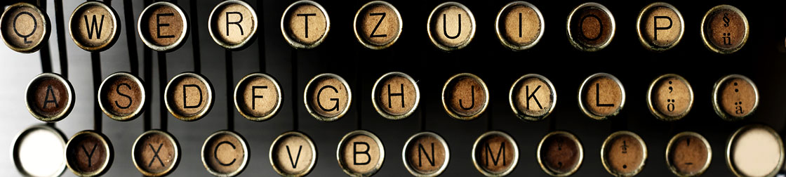
Upon scrutiny I eventually figured out that she was describing herself as a CSS Wizard. On the first and several subsequent readings, however, my not-20/20 vision construed the C as an O or A, and the W as either a tragically misshapen L or an omega caught in a half-Nelson.
I boggled. I looked again. I boggled some more. Then the utter improbability of a lizard applying for the position hit me hard in my sense of the absurd.* I spilled my beverage and laughed until my sides hurt.
The candidate passed with flying colors at making her résumé memorable. Unfortunately it wasn’t in the way she intended. The type choices played no part in eliminating her from consideration, but if she had been a stronger contender they would have prompted me to look closely at her portfolio to see if they were part of a pattern.
The truth is that designers who have never made questionable choices have never stretched creatively. Making mistakes is how we learn and grow professionally. Catching and correcting them before they go into production is the important part. Those of us working on the web are lucky because corrections there are comparatively cheap and easy.
Type readability’s importance varies with the medium and the urgency of getting the message across clearly at the first glance. Designers can unleash their creative impulses on an arts poster or CD cover (do we still have those?), but they’re better off reining in and prioritizing clarity when it comes to a résumé or a university web site.
Or a business sign along the highway.
It’s been a good 15 years now that I was heading home from the credit union when I noticed a sign on the corner below the overpass I was on. That sign, for a local scaffolding business, had been there forever; I knew it was there, but it had never worked its way into my consciousness. It did that day; for whatever reason, my brain registered fully what I was seeing — or not seeing, as it turned out.
The sign in question was quite simple. It was a landscape layout with a white background on the top half and a black background on the bottom. The top contained one word, Scaffolding, in red. The typeface was some sort of fine script from an earlier era of design. Combined with the color choice, the readability was not all that great.
The bottom, on the other hand, stood out just fine with its white text set in something akin to Arial Black. It read:
ERECTION SALES RENTALS
I nearly drove off the top of the overpass.
After I regained control of my car, my thoughts progressed from “Is that even legal in this state?” to a mildly disappointed “That cannot possibly have said what I thought it said.” I finally worked out the full message, with my car drifting all over the highway while I checked my rear-view mirror.
For a couple of years afterwards I made a point of watching for the sign whenever I passed that way. Then I moved away, the company was bought up by (I think) a national corporation, and when I returned for a visit the sign was gone. I miss it still.
The story, I think, pretty much says it all. I can only add that if you’re a designer and clarity is important to the project, try running it past a few folks with varying eyesight to find out if your work sends an unintended message. You don’t want to injure unsuspecting motorists or to make some sort of lizard of yourself when you’re trying to impress your next employer.
*I also cracked up at the zoo this summer when I saw bunches of kids in strollers parked next to the Small Mammals sign. OK, yes, I’m just weird. Let’s accept that and move on.
